Wednesday, February 10, 2016

I Kind Of Just Came Up With A Cool Idea And Ran With It.

I kind of just came up with this cool idea and ran with it. I printed some of my photos from my midterms and the folded them into origami boxes. I then strung them together with this really bright green string and hung them up in front of copies of the actual pictures that I used to make the boxes. One of my favorite pictures out of these is the one with the reflection. I used a certain lighting to get the glossy pictures to reflect the boxes. I took these pictures in front of a black sheet, but then edited the colors to make the black more black and the colors pop out more. I really love that this photo captures how creative and weird I am. I'd say I'm pretty outside the box.


Sorry about that cheesy joke. That was pretty Velveeta.

Tuesday, January 19, 2016

Midterm!

Black and white photos.


I chose to use three of my photos for the black and white portion because they all captured the rope around the bottle really well but from different views. My goal for this photo set was to highlight the rope in each photo. I also used the spot light in the room directed towards the rope so that when I went back in on photoshop to do the black and white it would be even more highlighted.


Double Exposure
For the double exposure I used two photos that I thought had one similar curved line in common so that I could blend them right at the orange and white vase. The first photo was and up close of a bottle opening (black and white.) I flipped it upside down after editing it so that the curve of the bottle top matched with the vase so I could make it look like the first photo was coming out of the second block. I left the second photo in color but brightened it a little just to see if I could get away with the drastic difference. I think this photo is awesome because the photos are layered with the layer mask that even thought they are completely different style photos, they blend well.

Blur/Depth
I like this picture because it is simple but shows depth. I had a bit of trouble blurring because I liked the picture as a whole already, so I only slightly blurred the background to let the photo stay more natural.

Detailed close ups!


I again used 3 photos for the close up portion. I like all these photos, and while some are stronger than others, I think the three of them together really capture the whole still life! The first one shows really great detail of the texture of the chair. The second one shows the hairs coming off the rope and the third shows the shine on the curve of the bottle  really well.


Thursday, January 14, 2016

Food Photography


For my food photography project I first used pretzel crisps, and the schools yogurt parfait. I made it more decorative by placing them on the ripped newspaper pieces that I put paint on. I also used little stones and sea glass to help decorate. This project was really aggravating because pretzel crisps don't usually stay in a vertical position so I had to put little things behind them to make them stand. This picture is really nice because you can see the detail of the  shine on the pretzels and the yogurt 

This next picture of the steak is nice because it captures the detail in the steak and the mushroom. The picture has a more personal type of feel to it because you cant see my dad eating in the background. I blurred him out so you wouldn't see that at first glance though, because although I like the feeling he gives to the picture I still want the main focus to be the food.                                                                           


This picture is great because you kind of immediately see the potatoes, which is nice since I missed them in the last class. I used the blur tool to make the food the main focus of the photo even though there is a lot going on in the background. 


This picture is another great version of the pretzels because it's straight on and the whole picture is in really good detail.

Double Exposure

"Blissfully Blue, Thinking of You"
For this picture I wanted to have a sort of serene yet melancholy feeling.
I used the same pictures of the trees twice, but they are flipped opposite ways and one is more faded in the background. I didn't mess with the color too much on the trees and clouds because I like the way the picture looked naturally when I took it while the sun was rising, I think that is where I get the feeling of serenity. The picture of me was first edited to black and white. I then used a blend mode to give it the bluish hue which brings in the melancholy feel, paired with a layer mask to make it slightly transparent. I named the final product "Blissfully Blue, Thinking of You" because the picture as a whole reminds me of a feeling that I sometimes get when I think of old memories. The feeling is when I remember a happy and calm time in my life that I miss. So the memories make me feel calm, yet sad that they won't happen again. I really love this picture because it has a lot of meaning to me and I think sometimes in this class we just rush to get things done and forget what photography is really all about.

"Absorbed" 

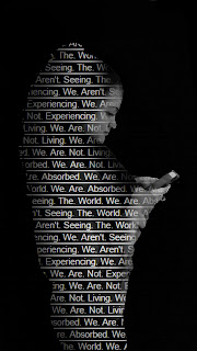
This picture I think really speaks for itself. First I took a picture of my classmate texting and made a selection of just her so I didn't have the wall and such in the background. I then typed the sentences, "We. Aren't. Seeing. The. World. We. Are. Absorbed. We. Are. Not. Living. We. Are. Not. Experiencing." and repeated them over and over and over again and took a picture of it to make the background. I added the text to the inside of the selection and used a layer mask to allow my classmates face to show through a bit. I also used the layer mask to show the phone because you couldn't exactly tell it was a phone with just the silhouette. For the last part of the picture I filled the background with black and faded the silhouette into the black background so it didn't look so soft. This picture is about how today, we are all obsessed with our phone, social media and etc. We text, tweet, instagram and snapchat about the world and beautiful pictures of it but we are never really experiencing it anymore because we are too busy texting, tweeting, instagraming and snapchatting about it! And the worst part is that nobody seems to care anymore, because we are ABSORBED


Thursday, December 3, 2015

Cloning Project

So many Sam's, not enough time.
For this project I took multiple pictures of my living room with me in all them but in a different spot each time. This project was kind of difficult but I got the hang of it eventually! I put all of the pictures together and used a layer mask to let certain parts of the pictures show through so it looks like there are a bunch of me! After that I flattened the pictures to make them into just one picture rather than a bunch of stacked picture. The last thing I did was play with the color balance to make the colors look better. 

Tuesday, December 1, 2015

Projection Project

Deer In Headlights.
For this project we had to project an image onto our model. I think this is the best picture we took because the placement was perfect. I did have to elongate the white background with photo shop but I think it looks nice. And I played with the colors and black and white balance.

Go To Wonderland.
For this picture I strategically placed my model and then cropped the picture to get out any weird things in the background. I also played with the color balance to bring out the blues, pinks and purple in the picture. 

I personally love both of the pictures!

Thursday, November 12, 2015

Refraction

For this picture, I cropped out the bottom of the image so you can't see anything other than the white of the table. I also made the picture black and white which does look cool, but at the same time it made some of the lines in the refracted part of the picture harder to see. I also don't like how I didn't get the full bottles in, because the background wasn't tall enough. I think this picture definitely could've been planned out better.
For this picture I cropped it a little bit, but I mostly just brightened it up and played with the greenness of the picture using color balance. I think this picture is much better than the first  color and detail wise, but I don't like the way the yellow bottle stands out way more than the clear ones.